June 2, 2017
Developer Insights: A look into Pokémon GO Loading Screens
Trainers,
We want to give you a peek into certain facets of developing Pokémon GO. For this post, we thought it would be fun to dive into the inner workings of what it takes to create a Pokémon GO loading screen.
We’ve seen that Pokémon GO loading screens and their gentle reminders to stay aware of your surroundings in fun and clever ways have received a lot of attention from the community. Typically, most discussions surrounding a loading screen revolve around the anticipation players feel before they start playing a game, but thanks in large part to Mieke Hutchins—our rock star artist at Niantic—brand and design experts at the Pokémon Company, and the rest of the design team at Niantic, this hasn’t always been the case with Pokémon GO. From outstanding fan art to requests for high-resolution wallpaper versions of each loading screen, we frequently see players sharing their love for the Pokémon GO loading screens. Because we’ve seen such amazing feedback about this artwork on various social media channels, we wanted to give you an inside look at the work that goes into creating a new loading screen with the help of Mieke herself.
Mieke Hutchins:
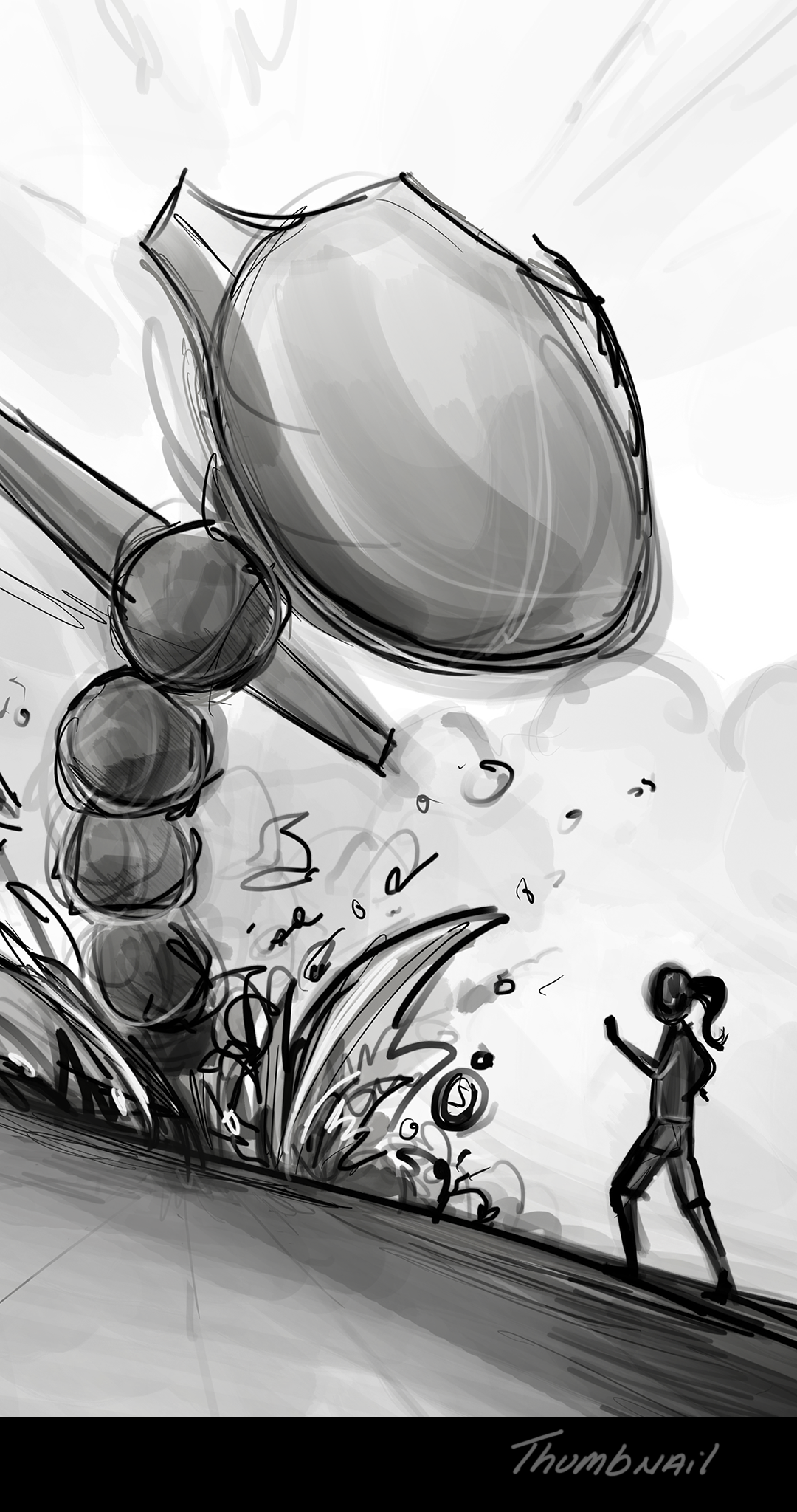
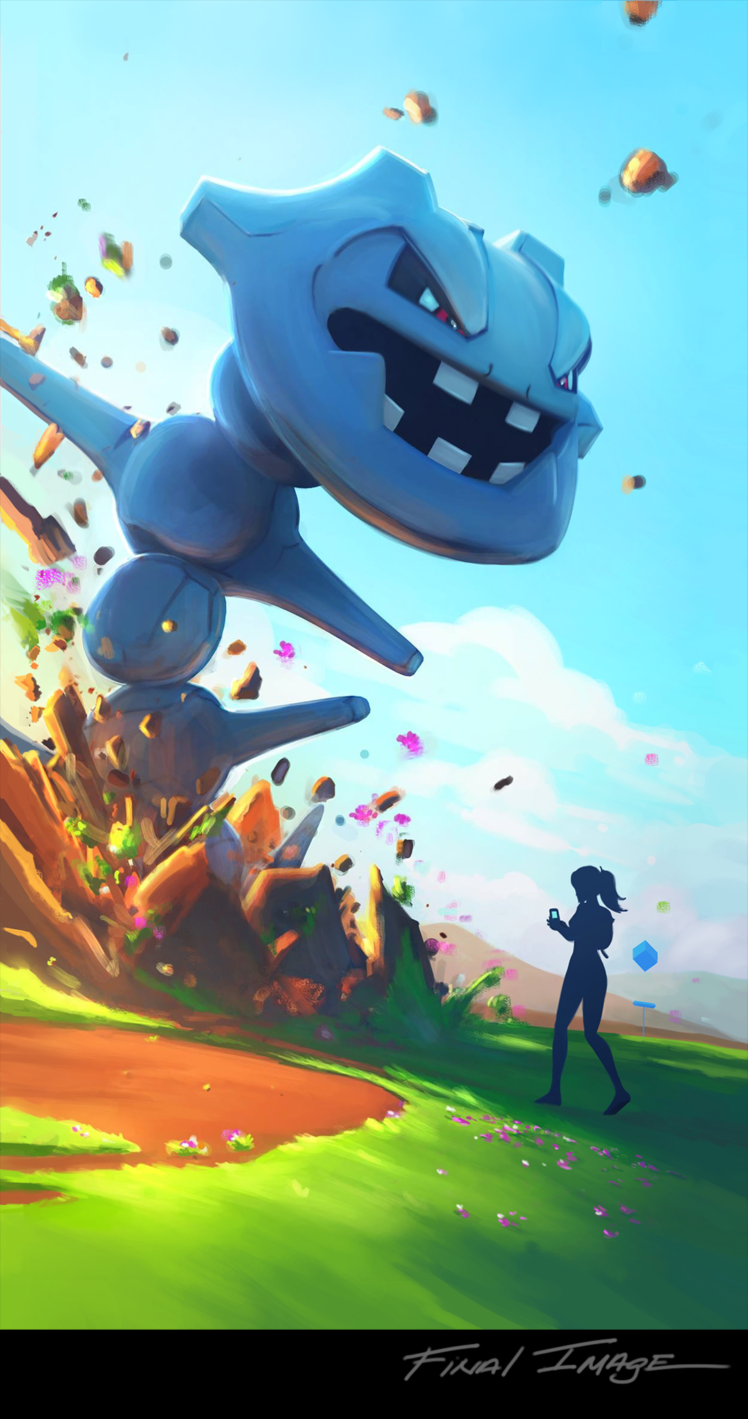
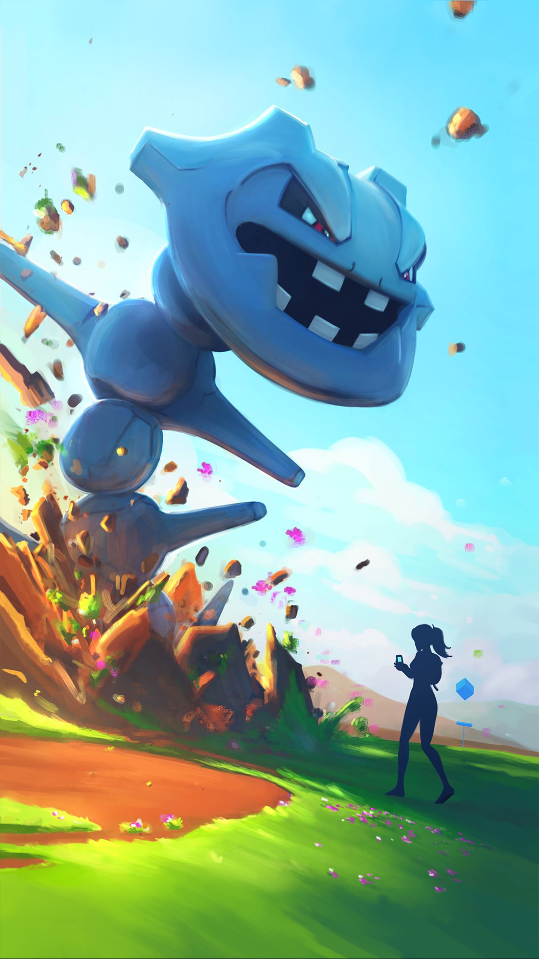
When designing a loading screen, the team starts by discussing what the most appropriate Pokémon to feature is based on surrounding events and the latest product release. In the case of the Steelix loading screen, we knew we wanted to celebrate the recent introduction of Pokémon originally from the Johto region to Pokémon GO. We wanted to create a throwback to the original Gyarados loading screen by using an epic Johto region Pokémon with a similar shape and size, and Steelix was the best fit. After choosing the most appropriate Pokémon to feature, it was then time to begin drafting concepts! We spent some time looking at references in various art books, online, and in nature for compelling compositions, lighting, and interesting color schemes. After we had done a bit of research, we created a simple thumbnail sketch (shown below) to discuss the overall idea and rough composition with the team. The plan at this stage was to have a strong sense of what the eventual artwork would look like.
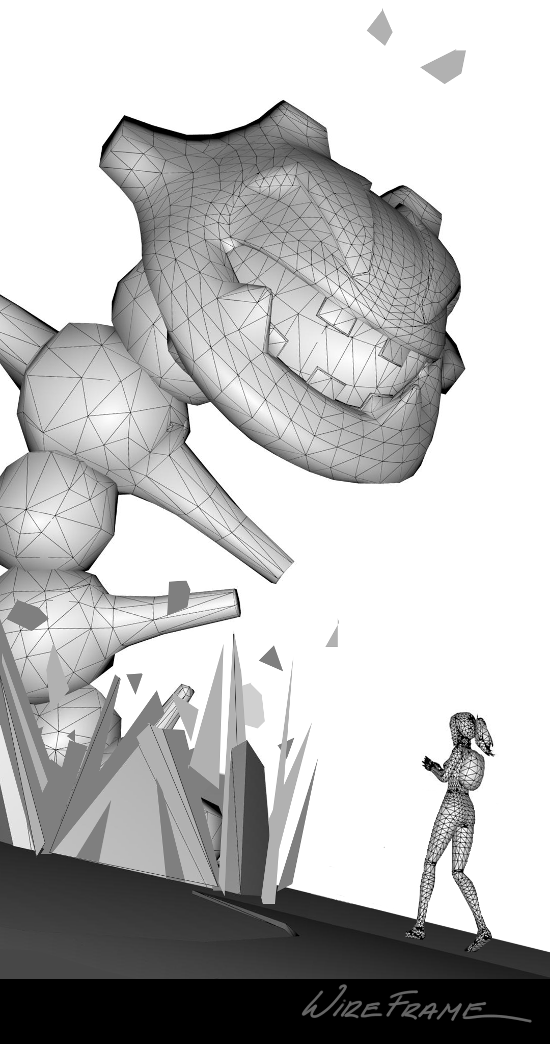
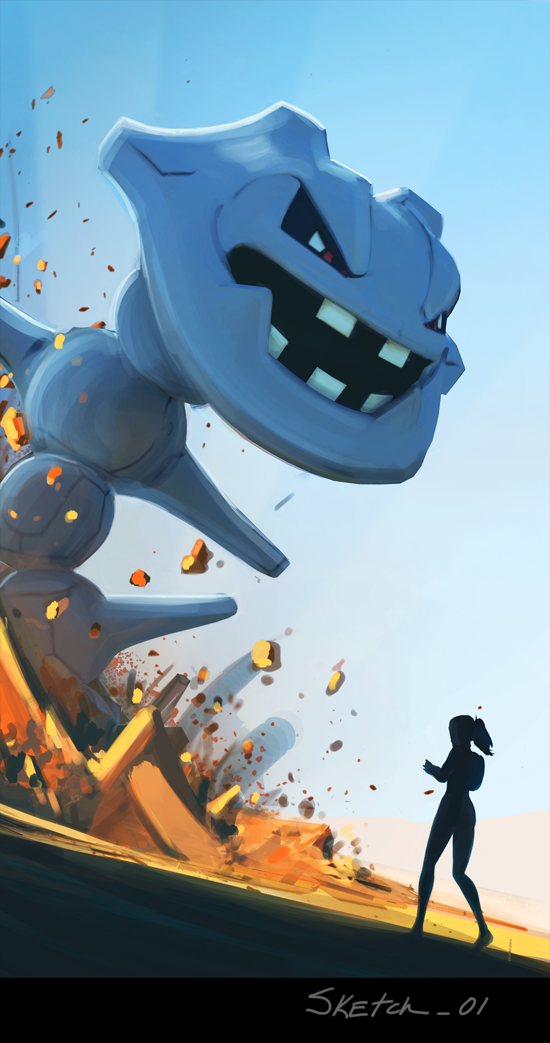
Once a rough sketch was created and everyone felt comfortable with the general direction, we placed the actual in-game models in the frame to establish scale and stay true to the precise look of the Pokémon. We also wanted to try to lock down the camera positioning, as well as start blocking in color. The color scheme we chose had to read on a phone screen in all kinds of lighting scenarios, including bright sunlight. That can sometimes be a challenge, because Pokémon GO is a game played on the move. We chose a complimentary color scheme for this reason and to heighten the contrast and tension in the screen, so we started with blues and oranges. At this point in the process, we really started to get a good sense for the look and feel of the loading screen.
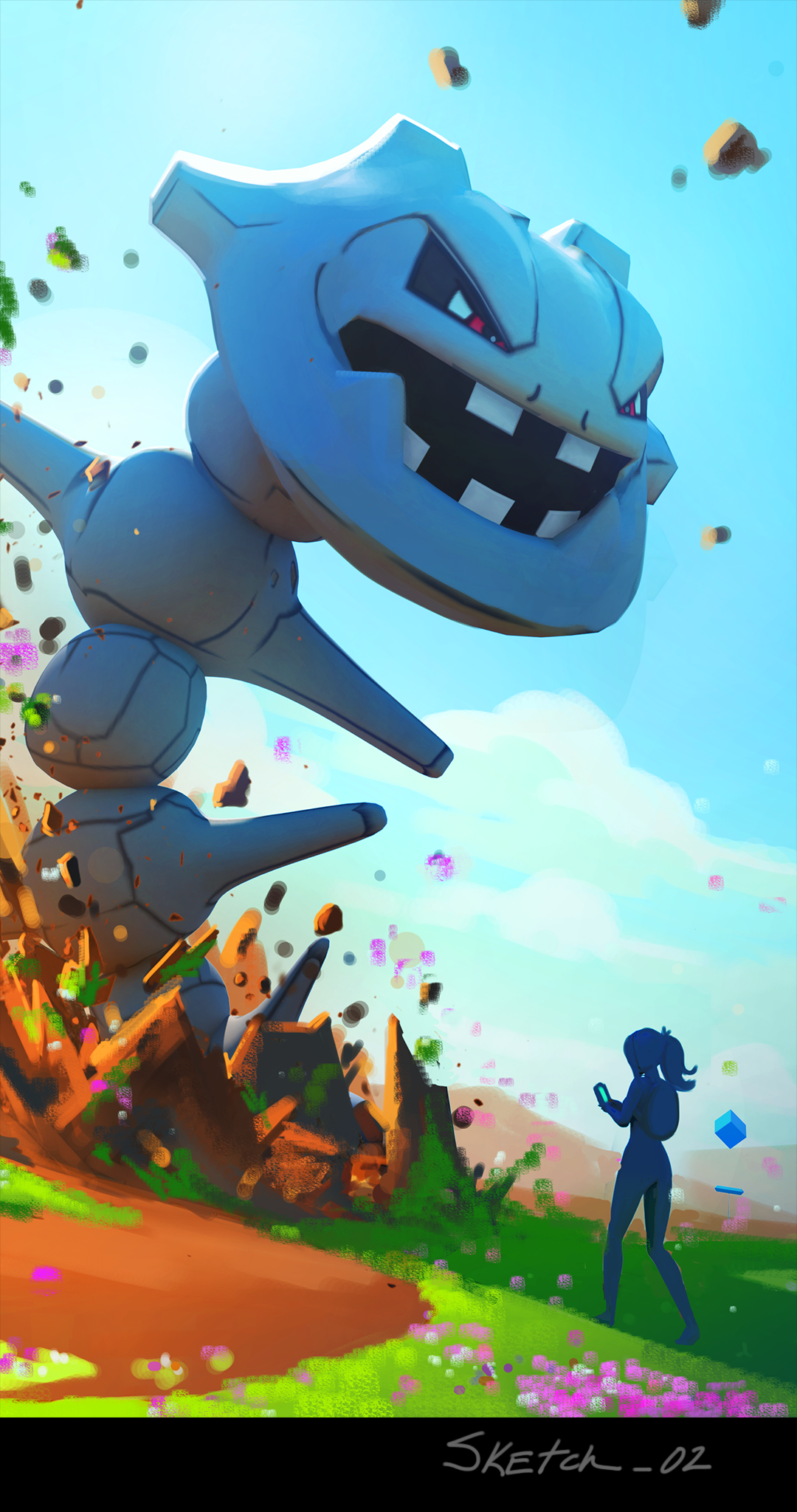
Once we figured out the optimum lighting, composition, and mood of the illustration, we tested it one more time on the phone and worked with the brand and design experts to add any final touches to the screen. And voilà—our Steelix loading screen was ready to go! We then worked with our Engineering team to implement it in the live product for you to see the next time you logged in.
We really hope you enjoy checking out these loading screens as much as we enjoy making them. Stay tuned to see what’s coming up next!
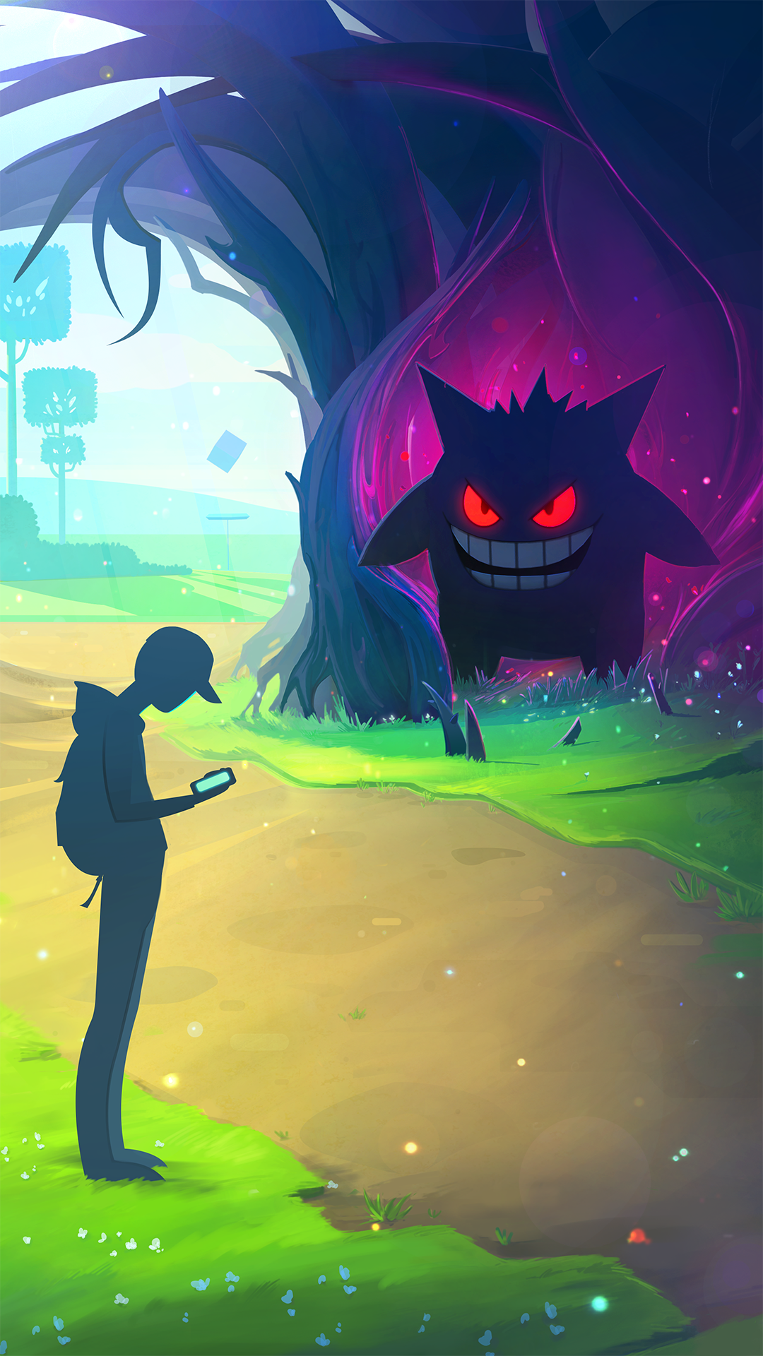
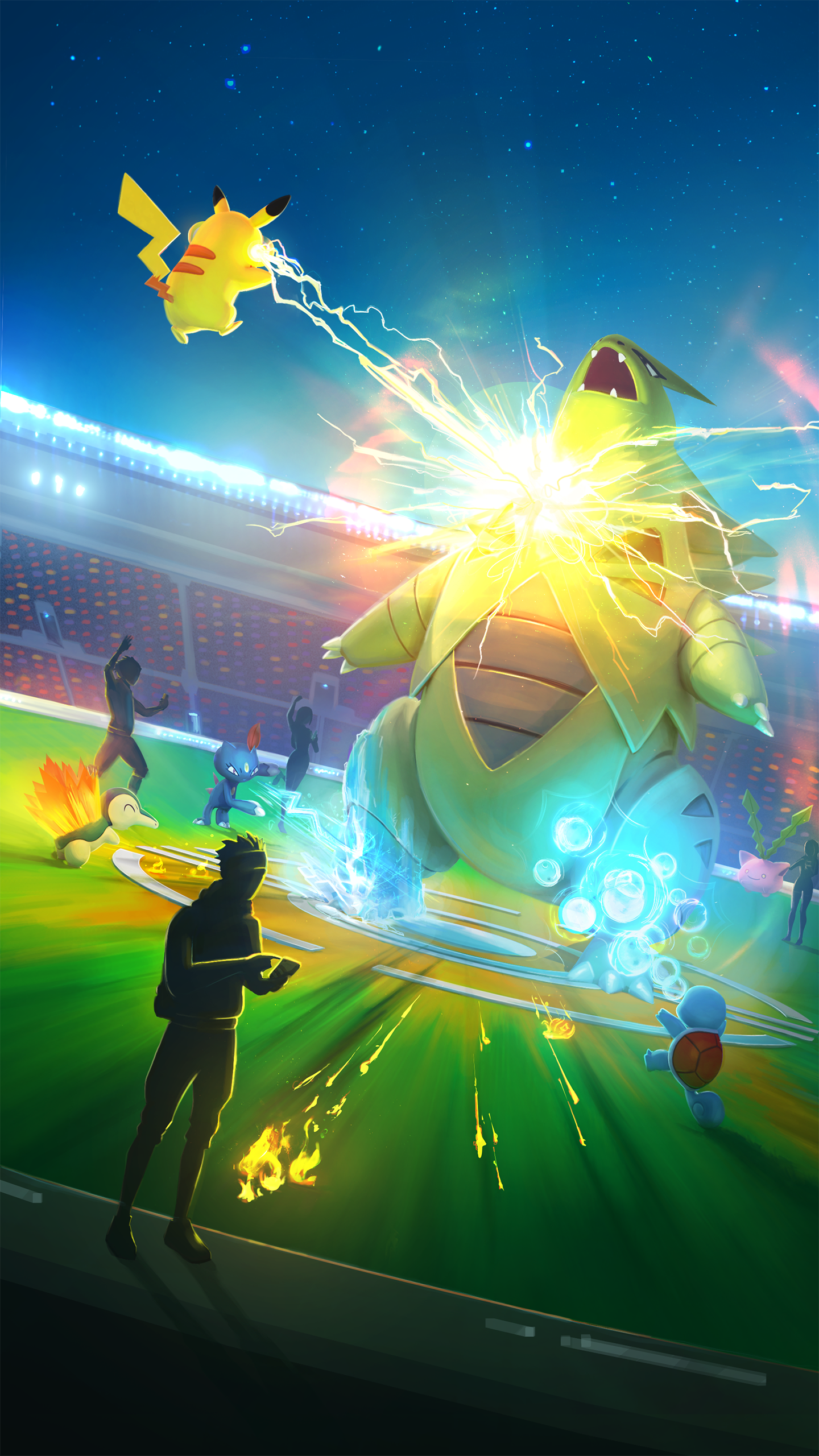
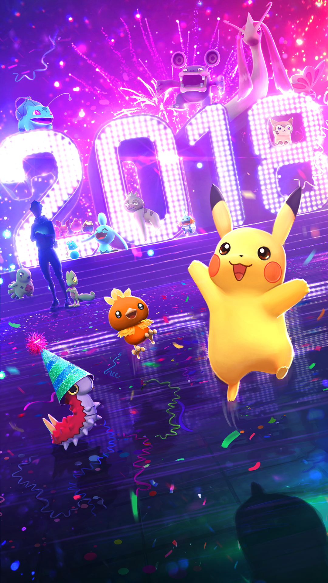
To view and download all of the Pokémon GO loading screens in high resolution, click the images below.
Have a favorite Pokémon you’d like to see featured in the next loading screen? Tell us who you’d like to see appear on the next loading screen on your favorite social media channels using #PokemonGO and we’ll take your suggestion into consideration!
—The Pokémon GO team

